Introduction
This is an investigation into how an individual’s choice in residence may impact their health. Cancer rates are the main parameter to determine the overall health of each county in the United States. Cancer is currently the second leading cause of death in the nation, the causes of which have been linked to many poor health choices, including environmental factors, making it a very good indicator of the health of populations. A dataset from the NIH that includes cancer type, demographic information, and location for each across the United States is used for this analysis. Two additional datasets describe the environmental status of each county in the United States. Air quality datasets were gathered from the Environmental Protection Agency that shows air quality indexes for common air pollutants such as NO2, O3, and CO. Additionally, a water quality dataset was gathered from the Center for Disease Control (CDC) to observe the heavy metal contaminants in the drinking water sources for each county. These three datasets can describe a basic picture of each US County’s environment, and how this environment might be correlated with cancer rates.

Data Collection, Cleaning, & Normalization
Cancer rates across the United States were obtained through an NIH dataset. The datawas relatively clean but some edits were made for analysis. Symbols that existed in some columns were converted to nan values, the index column was removed, and the “County” column was broken into four separate columns: State, County, SEER Registry Number, and NPCR Registry Number. Additionally, all the numerical columns that were imported as strings were removed and converted to numeric values for analysis.
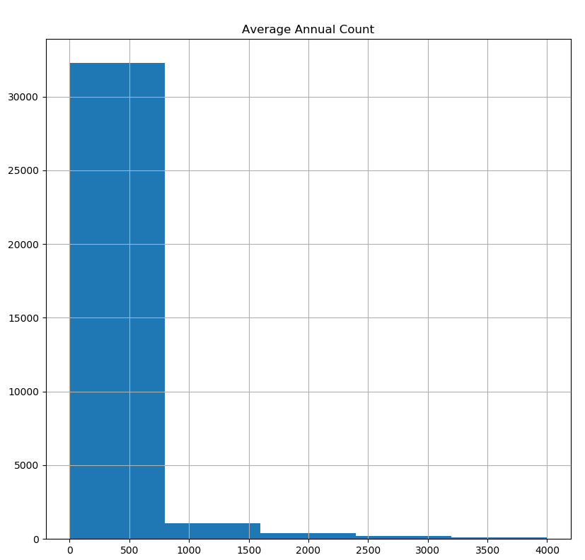
In the histogram below ‘Average Annual Count’ shows a few hundred observations having average annual count of more than 2500, which are possibly outliers. In order to confirm whether these observations are outliers, a subset from cancer data with an average annual count of more than 2500 was created. A large number of such observations are from California, New York and so on. All other variables were normal. Therefore, these variables were not removed as they could contain valuable information in analysis.
Air quality scores were obtained from the Environmental Protection Agency for each county in the United States. This data was also relatively clean but edits were made for the purpose of analysis.
In order to join this dataset with other datasets, the FIPS county and state codes were added to this data frame. To do this, each county string was cleaned to match with the county string in the FIPS county code data frame so that the county and state codes could be easily added. There were no null values that needed to be removed, although outliers were present and discussed below.
Next, the numerical values were normalized into proportions. Since the Air Quality Index was not recorded for the same amount of days for every county, the “Good”, “Moderate”, “Unclean”, etc days columns needed to be divided by the number of days AQI was recorded (“Days with AQI”), so that these records could be compared to each other. This also applied to the “Days CO2”, “Days O3” etc. columns, in which the pollutant mentioned was the primary pollutant for the number of days specified. These columns were added to the data frame as “Previouscolumnname_Norm”. For example: “Good Days_Norm”.
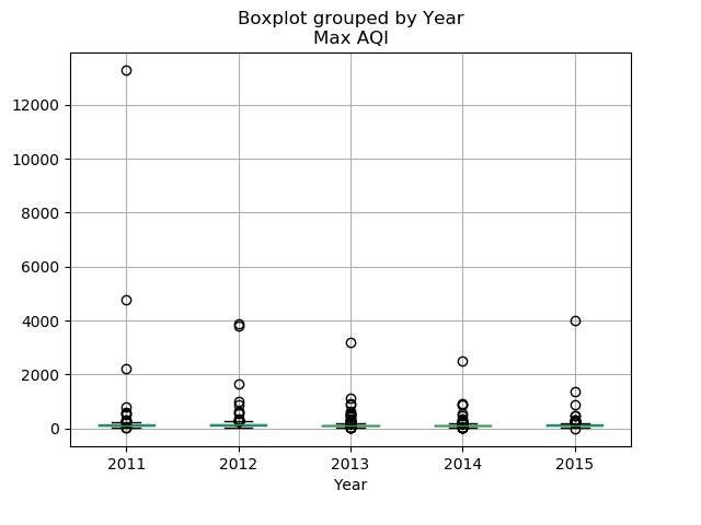
When checking for outliers in the numerical data of the air dataset, many outliers were found by using boxplots. The 'Good Days_Norm', 'Moderate Days_Norm', ‘Unhealthy for Sensitive Groups Days_Norm’, Unhealthy Days_Norm”, ‘Very Unhealthy Days_Norm’, ‘Hazardous Days_Norm’ and 'Max AQI' all showed outliers, but for each column except ‘Max AQI” these outliers were left and deemed “extremes” for each column. However, as the “Max AQI columns contained values above 500, which is the max AQI score, these records were completely removed from the data frame (Figure 2).
Water quality data for each county was collected through data from the Center for Disease Control. This dataset was relatively clean, but edits were made for the purpose of analysis. The “Location” column was split into a “county” and a “state” column. Additionally, columns such as “geoAbbreviation” and “geoID” were redundant and only one was kept. The water quality mean was also binned into 3 categories: “No pollution detected”, “detected but no harm”, and “detected and harmful.” After cleaning, the “result” data frame was used for analysis and contained only 6 columns with pertinent information for analysis. Overall, there were no missing values found after checking each column with .isna(), value_counts and unique() functions in the original dataset during Part 1 data processing stage.
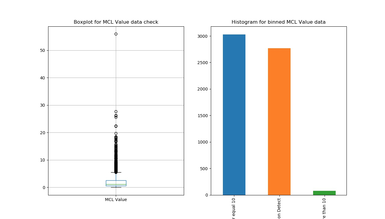
For the water quality dataset, there is only one numeric column: ‘value’ (level of Arsenic concentration). According to the CDC’s documents, lowering the minimum contaminant load (MCL) from 50 to 10 ppb statistically reduces bladder and lung cancer mortality and morbidity by 37-56 cancers a year in the U.S. (EPA 2001b). Therefore, outliers can not be examined and defined only by applying boxplot function (left in Figure 3). Though there are some points out side of the IQR box, but they should not be considered outliers, because there are many zeros in the dataset and these zeros cause the IQR lie at the bottom. Therefore, these points should be considered normal points within a reasonable range. As a second way to test for outliers, ‘Values’ were binned into three groups, and a histogram created to show the frequency of each group. The results of the two figures indicate that there were no outliers in the water quality dataset.
Finally, some values in the dataset were binned to assist with analysis. As mentioned before, the level of Arsenic concentration (water quality indicator) was binned into three groups: “No pollution detected”, “detected but no harm”, and “detected and harmful” by considering the CDC official guide (right in Figure 3). For examining this new binned column, “sum([the binned column]).isna())” code was applied, showing a result of “0”. Therefore, there were no missing values binned.
Hypotheses
Hypothesis 1
“We expect that as air quality gets worse, the cancer rates in each county will increase. We also expect this effect to be most significant among lung cancer rates.”
Hypothesis 2
“We expect that as water quality decreases, cancer rates in each county will increase.”
Hypothesis 3
“The air and water quality scores in each county can be used as predictors for that specific county’s cancer rate (the average number of individuals affected with cancer in each county over a five year period).”
Hypothesis 1
“We expect that as air quality gets worse, the cancer rates in each county will increase. We also expect this effect to be most significant among lung cancer rates.”
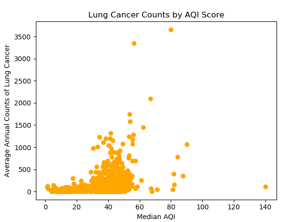
The overall trend in the United States shows that as the median AQI score increases (air quality gets worse) the cancer rates also increase. However, there are some unique outliers that show low cancer rates in counties with very high AQI scores. From these results, it is possible that type of pollutant might matter when examining cancer rates realted to air quality scores, as well as the population of the county. For example, the two-circled counties have similar air quality, but their average lung cancer counts are very different. It turns out the one at the bottom is Tulare County, which is ranked the sixth most ozone-polluted county in the US. So people are more likely to get lung cancer. The one at the top is Los Angeles County. Additionally, the reason that LA county seems to have higher average lung cancer counts is LA County has 20 times more population than that of Tulare county. If a normalized lung cancer rate is calculated by dividing the cancer counts by the population, lung cancer count per person for Tulare County is 0.01% higher.
In contrast with this theory however, the following is a bar plot that compares the number of days with particulate matter less than 10 micrometers but above 2.5 micrometers, number of days with particulate matter less than 2.5 micrometers, and the age adjusted cancer incidence rate per 1,000,000 cases, for each state. The figure shows that even for large variations in the number of days with particulate matter smaller than 10 or 2.5 micrometers, the age adjusted incidence rate does not fluctuate much. It seems that the cancer rate is relatively the same across multiple states.
However, a possible problem is that some states did not collect AQI data for every day of the year. For example, some states collected data only 160 days out of 365 days. Because of this, another bar plot was created to compare median AQI and age adjusted cancer incidence rate per 1,000,000 cases. The plot does not show any noticeable patterns.
Hypothesis 2
“We expect that as water quality decreases, cancer rates in each county will increase.”
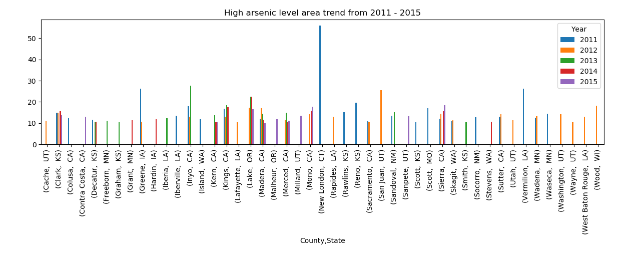
This graph presents the arsenic level trend in counties with 10mg/L arsenic level from 2011 – 2015. Some counties only had bad water quality in a specific year, while other counties suffered bad water quality in all years examined.
Based on these mixed results, a linear regression was applied to explore the relationship between water quality and cancer rate. The scatterplot (Fig1) shows arsenic content against cancer rate, and the red line in the plot describes the equation of linear regression: cancer rate=-4.91*arsenic content+456.85, which means that cancer rate would decline if water quality decreases. As Fig1 shows, the arsenic content of most points lay from 0 to 10µg/L. However, these points at low arsenic level between 0 and 10µg/L are not so meaningful for exploring the relationship between water quality and cancer rate. According to the research, “Long term exposure to drinking water containing arsenic at levels higher than 10 ppb increases the chances of getting cancer; for lower levels the chances are less.”(1) We define water containing arsenic at level above 10µg/L as harmful water. Therefore, these high cancer rates at low arsenic level should be explained by factors other than water quality, such as stress, bad living habits, etc. Hence, focusing on harmful water (arsenic content>=10µg/L) would be more representative. As a result, Fig2 shows a positive correlation between the arsenic content and cancer incidence, and the regression equation is cancer rate =2.72* arsenic content +375. In conclusion, for harmful water, the worse the water quality is, the higher cancer rate is.
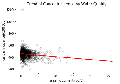
Scatterplot of overall arsenic content against cancer rate.
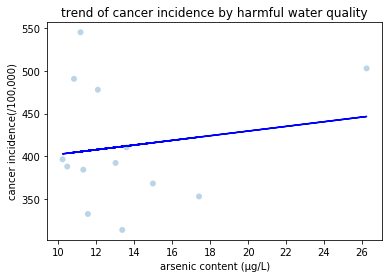
Scatterplot of harmful water against cancer rate.
Hypothesis 3
“The air and water quality scores in each county can be used as predictors for that specific county’s cancer rate (the average number of individuals affected with cancer in each county over a five year period).”
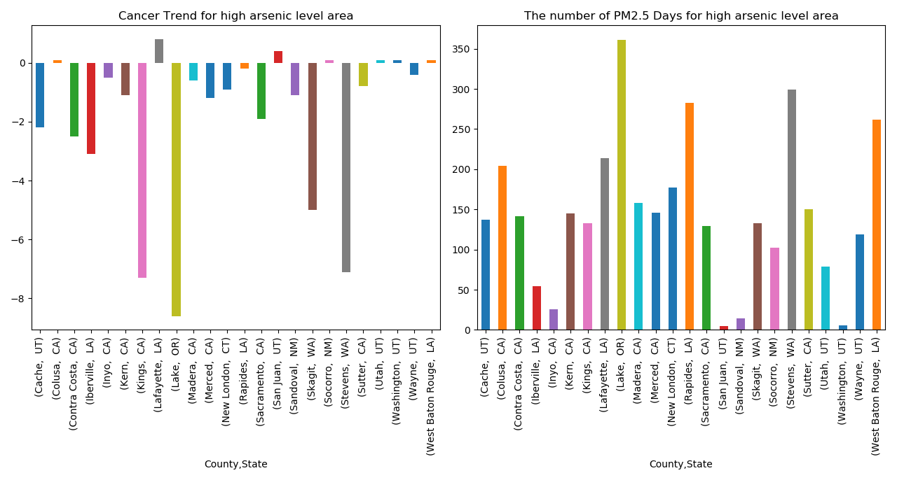
Since only certain counties were considered to have a dangerous amount of arsenic in the water content, we first graphed the annual cancer trend for each of these counties (left figure). This figure showed that the cancer trends were mostly falling in counties with dangerous arsenic content, which was a surprising result. We then wanted to determine if these counties had unusually high amounts of particulate matter (above 2.5) to see if there was a trend in poor water quality and poor air quality. In this case, the majority of the counties spent over 100 days of the year with high amounts of particulate matter in the air. Therefore, we can conclude that counties with poor water quality also have poor air quality. From these results, it was determined that air quality was likely a better predictor of cancer rates in the US than water quality. To further test this theory, we performed machine learning techniques, created maps, and ran network and clustering analyses.
The machine learning algorithm K Nearest Neighbor (KNN) was used to test how well water and air quality predict cancer rates for each county using the following labels: (0-25%, 25-50%, 50-75%, and 75-100%).
The KNN algorithm used the three datasets and classified “new” data points based on a similarity measure. The classification was done by a majority vote to its neighbors. The accuracy results of using air and water quality scores as a predictor for the average number of individuals with cancer in each county for KNN was: 0.66. When only air quality was considered, KNN did even better with an accuracy score of 78%.
Based on the machine learning results, maps were created to see if trends could be visualized for the counties in the United States. The following maps show cancer rates and environmental indicators. The age-adjusted incidence rate is displayed in the filled counties; the darker red a county is, the higher the cancer rate per 100,000 in population. The dots on top of the counties indicate the environmental indicators, from arsenic levels in the water to air indicators like ozone and PM10. The user may also toggle between various cancer groups using the filter to the right of each map; the default is total cancer rate for the population but there are also age groups, ethnicity, gender, and specific cancer types to choose from. On these maps, any counties lacking either cancer data or environmental indicators are null, or empty.
Arsenic Map
Median AQI Map
Days CO Norm Map
Days NO2 Norm Map
Days Ozone Norm Map
Days PM10 Norm Map
Days PM2.5 Norm Map
Days SO2 Norm Map
The map was able to show specific county’s cancer incidence rates, along with their average air and water quality. Since it was hard to determine significant patterns based on the map, a simple network was created in which counties were connected based on having the same cancer incidence rates. The goal of this network was to visually inspect air quality similarities in clusters of counties that had the same air quality.
Two networks were constructed: a network showing all counties, and a network showing just the counties in California. The nodes were colored based on the average proportion of good air quality days each county had. Red nodes had an average of 0-20% of days a year with good air quality, Blue nodes had an average of 20-60% of days a year with good air quality, and Green nodes had an average of 60-100% of days a year with good air quality. The All County Network displayed two distinct clusters, but the clusters were not unique to air quality. Therefore, a second network was created to see if clustering was significant in a particular state. Since California appeared to have some interesting patterns based on some past analysis, the counties from California were chosen for the nodes in the second network.
The California network resulted in two clear clusters, one cluster with cancer rates in the 25-50% quartile and one with cancer rates in the 50-75% quartile. The clustering coefficient was 1.0, which is due to the fact that each county was connected to counties with the same cancer incidence. There were 31 counties connected in one cancer cluster, and 20 counties connected in the other. The density of this network was 0.51, since each county is connected to approximately half of the other counties. Based on the clusters, there is no clear relationship between the number of good air quality days and the cancer incidence rate in California, similar to the All County Network. The network analysis helped to visualize the cancer and air quality trends in the United States and California. An interesting prospect for future study would be to create networks for all 50 states to see if there are particular states that show clear clusters based on air quality and cancer incidence rates.
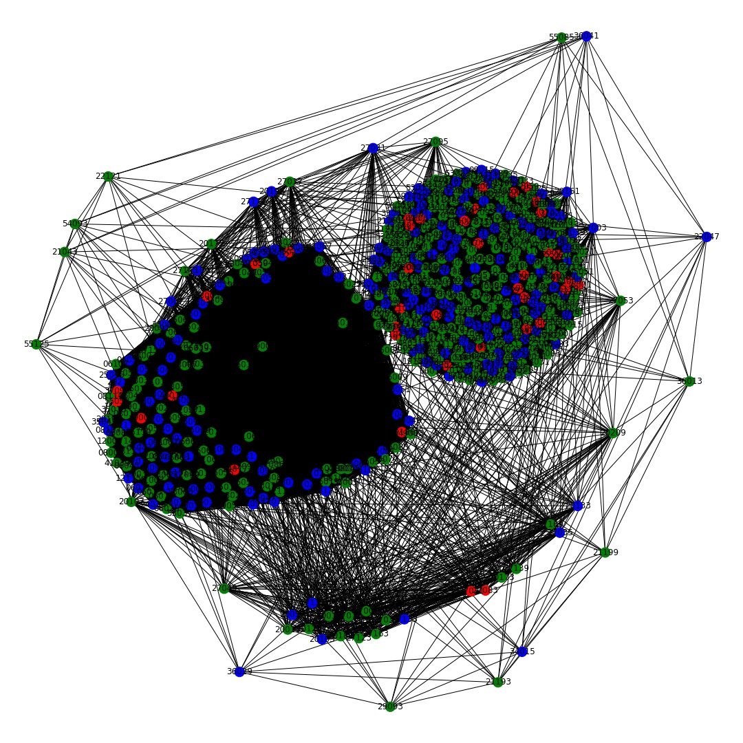
Network of all counties.
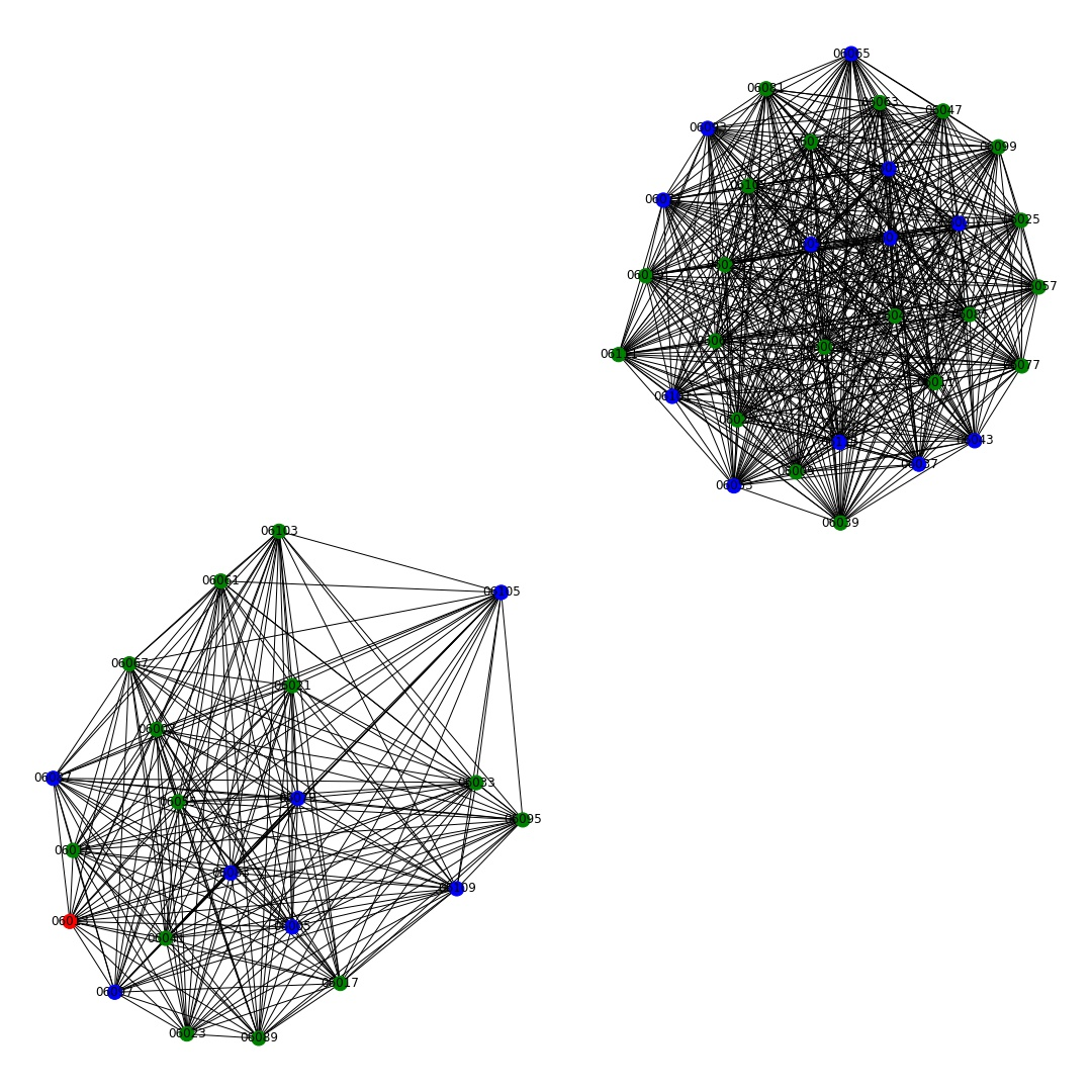
California Network.
To see if the assumptions gathered visually from the network analysis were correct, three cluster analysis were conducted to explore groups of counties that may share similar overall cancer rates, water qualities and air qualities: Hierarchical Clustering, Partition Clustering and dbscan Clustering.
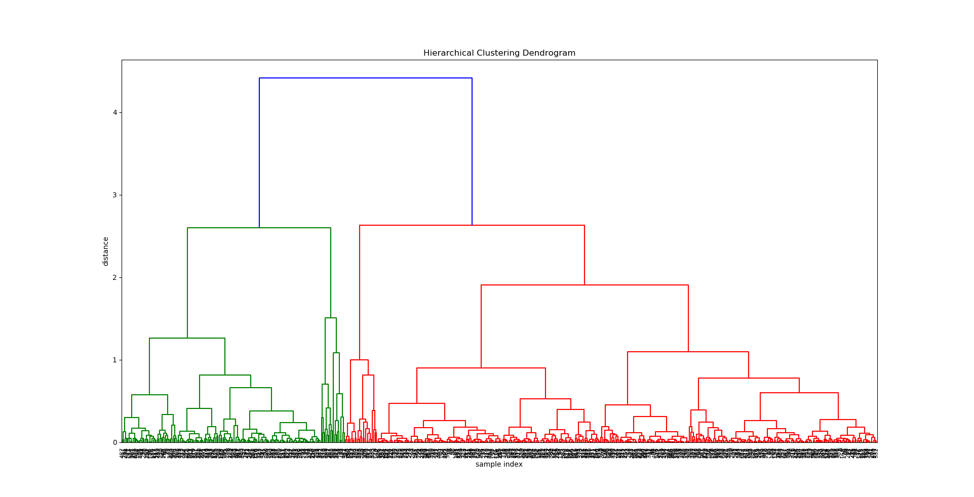
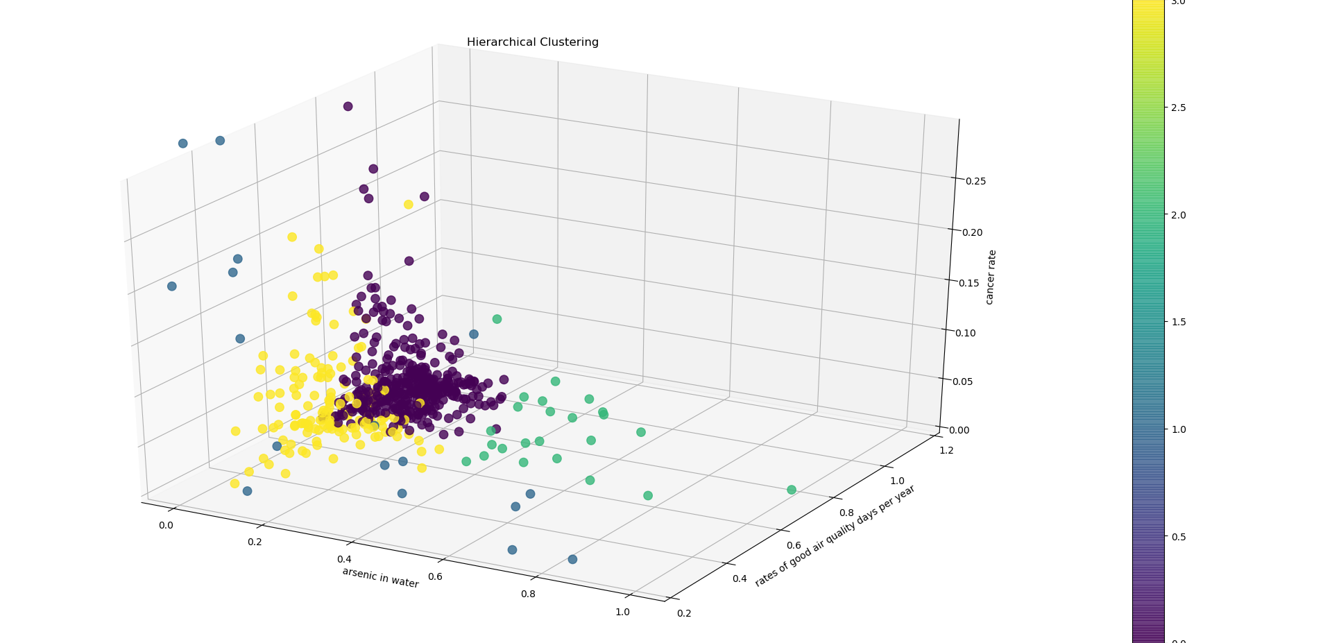
Visual depiction of the 4 clusters created in hierarchical cluster analysis.
The hierarchical clustering analysis shows that counties that are in the same cluster tend to have different cancer rate. In other words, counties that share similar environmental factors (in this case water and air quality) are likely to have different cancer rates.
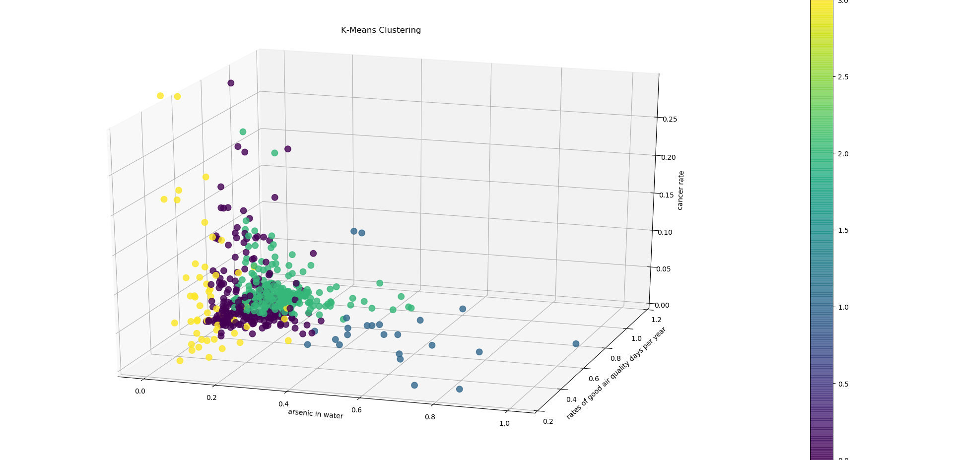
A visual depiction of KMeans cluster analysis.
Unlike the hierarchical clustering, KMeans clustering clustered counties with a relatively low cancer rate together. However, the silhouette score was lower than the hierarchal, which suggests that KMeans is not a good algorithm to use for this data.
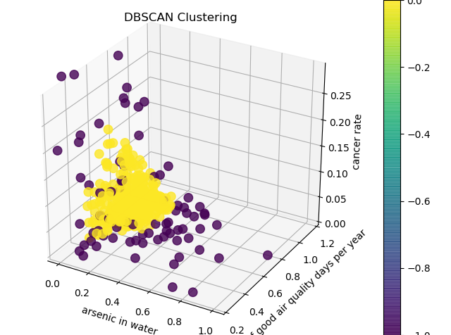
A visual depiction of dbScan cluster analysis.
This method has detected a pattern that the other two have not detected. However, there is no apparent meaningful interpretation for this pattern.
In conclusion, the clustering analysis confirmed our visual interpretation of the data in that counties with similar air and water quality are likely to have different cancer rates. This suggests that there may be other factors other than air and water quality that may be affecting cancer rates in the US. In order to detect clearer and more meaningful pattern, one should collect a larger dataset or include more factors such as county income and health insurance.
Conclusion
Air quality seems to be a better predictor than water quality of cancer trends in the United States based on machine learning and regression models. One explanation for this is that it is much easier to avoid drinking county water than it is to breathe county air, and therefore air quality will provide a more reliable prediction of cancer rates.
However, based on the visualizations and network analysis, there are no obvious cancer trends that can be predicted based on air quality in the United States. While the initial analysis of the water quality, air quality and cancer data in the United States provided substantial, important information to be used in further and final analysis, the question “Where should you live for your health?” can clearly not be answered with just air and water quality data. The good news for most people considering moving to major US cites is that these cities have generally good air and water quality. Therefore, it could be useful to see this nation in context of other nations, particularly those that are still developing. The results of the tests performed indicate that air quality might be a better predictor of cancer rates than water, but further analysis on specific types of pollutants, as well as causes of pollution (i.e. power plants, landfills, etc) should also be conducted.